Most law firm websites don't lose clients because the firm isn't good enough. They lose clients because the website makes the wrong first impression, before anyone ever picks up the phone.
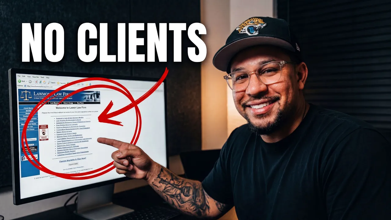
I recently rebuilt the hero section (the top of the homepage, the first thing you see) for a real family law firm with 35 years of experience. Great firm. Great reputation. But the top of their site was quietly sending potential clients to their competitors.
Here are the four changes that made the biggest difference, and that almost every law firm website gets wrong.
The 4 Fixes Every Law Firm Website Needs
1. A Headline That Names the Client
The original headline read "Compassion & Guidance For Your Family." It's warm, but it could belong to any firm, for anyone. It doesn't tell a visitor you handle their exact situation.
The Fix
A headline that names the problem and the outcome, something like "Divorce and Custody Guidance That Protects Your Family's Future." Now someone in the middle of a custody fight reads it and immediately thinks, "That's me." Your headline should meet clients where they are, not make them translate.
Most visitors decide in seconds. Here's why people leave your website in the first 5 seconds.
2. Positioning That Sets You Apart
This firm's real strength, 35 years focused on family law, was buried paragraphs down the page. The copy also talked about the firm ("we aim to provide…") instead of the client.
The Fix
Put what makes you different right near the top: "35 years of focused family law experience, serving your community." That one line signals experience, focus, and confidence, the exact things a nervous client is looking for. Want to score your own site? Use my 4-pillar website audit checklist.
3. Trust You Can Actually See
The old hero had no faces, just a stock image and a couple of short reviews. People hire lawyers they trust, and trust starts with seeing who you are.
The Fix
Use a real photo of the attorneys. When visitors can see exactly who they'd be working with before they call, hesitation drops. Real people beat stock images every single time. It's one of the 5 mistakes quietly costing you customers.
4. The One Button Most Firms Get Wrong
This is the big one. The original site's only next step was "Contact Us," leading to a long form and a phone number. For someone anxious and overwhelmed, that's a big ask. So they don't do it.
The Fix
Give them one clear, low-pressure action: a bold "Book Free Consultation" button, right where the eye lands, with the phone number close by. When the next step is obvious and easy, more people actually take it. Same problem I break down in why your website isn't getting you calls.
The Bottom Line
A law firm website's job isn't to look pretty. It's to turn visitors into booked consultations. Name the client's situation, lead with what makes you different, show the real people behind the firm, and make the next step effortless. Those four fixes are the difference between a website that decorates and one that books clients.
Ready to Fix Your Law Firm Website?
I rebuild law firm websites so they actually convert visitors into consultations. Book a free strategy call and let's take a look at yours.