Most visitors decide whether to stay on your website in about five seconds. That fast. In those few seconds they are answering one question: is this the right place, or should I go back and click the next result.
If your site does not answer quickly, they leave. They do not email you first. They do not give it a second look. They go to a competitor, and you never find out they were there.
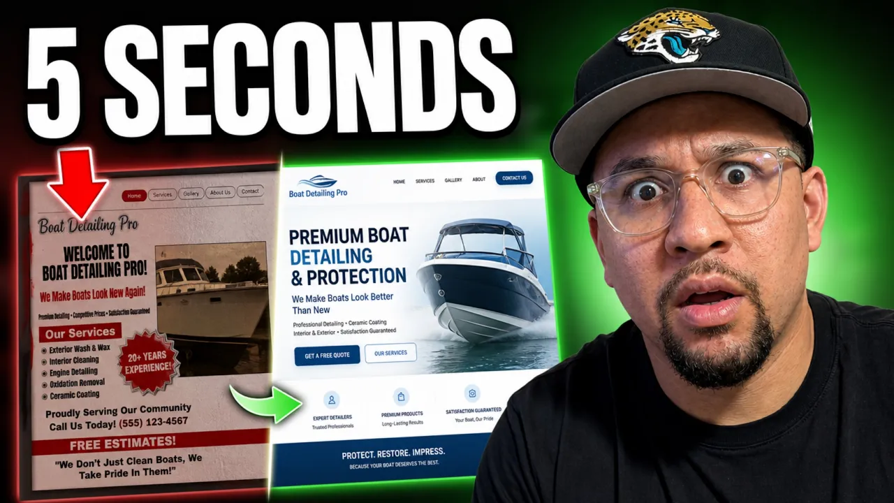
I want to show you exactly where that five-second decision is won or lost, using a real example. This one is a friend's boat detailing company. He is even running ads to this page and getting customers from it, which makes it the perfect case. If the page were clearer, every one of those ad dollars would go further.
The five seconds happen at the top of your homepage
Your homepage is where most people land, and the top of it, the first thing they see before scrolling, is where the decision gets made.
That top section has four jobs. It has to answer:
What do you do. Who is it for. Why does it matter. What should I do next.
Get those four right and a visitor can decide to hire you without scrolling another inch. Miss them and they are gone. Everything below is about whether this boat detailing page answers those four questions, and how to fix it where it does not.
What the page already got right
Credit first, because the instincts here are good.
The first line says exactly what the business does: boat detailing. No guessing. That matters, because confused visitors do not become customers. They leave.
The buttons say what they do too. "Book now" and "Contact us." You click and you know what happens. No mystery.
And the colors fit. Deep ocean blues, a sea feeling, buttons that stand out from the rest of the page so your eye finds them. The bones are there. The problem is in the details, and the details are where trust quietly leaks out.
The small things that cost credibility
Here is something most owners underestimate. Little flaws do real damage. Not because any one of them is a dealbreaker, but because a visitor adds them up without realizing it.
On this page, the logo overlaps the bar behind it and looks unfinished. The logo itself is so detailed you cannot actually read the business name. The background image is low resolution and grainy. The headline ends in an exclamation point, which reads more like a text message than a premium service.
None of these are huge on their own. Together, they whisper "not quite buttoned up." And a visitor deciding whether to trust you with an expensive boat hears that whisper.
Part of this is what happens when one person makes the logo and someone else builds the site, and the two never quite fit together. The cleaner path is one designer handling both your brand and your website, so the pieces match. The fix is care. Clean, readable logo. A sharp image. Wording that sounds like a professional, not a flyer. Polish is not vanity. It is credibility you can see.
The image is fighting the message
The background shows a boat being swallowed by a water vortex. It is dramatic, but think about what it makes you feel. Stress. Chaos. The opposite of what a boat owner wants associated with their boat.
A premium service should feel calm and in control. The picture should show the result you deliver, a beautiful, spotless boat, or the kind of person who delivers it. Not a boat in danger.
In the redesign, I swapped it for a clean photo of the owner, sharp uniform, professional, with the Florida coast behind him. It reads white-glove. It says premium before a single word is read. And people buy from people they can see.
"Affordable" is attracting the wrong customer
The page uses the word "affordable." Be careful with that one.
"Affordable" attracts price shoppers. People hunting the lowest number, not the best service. And boat owners are not short on money. They can pay for quality. When you lead with cheap, you invite people who will haggle and walk, and you push away the premium client who wanted to feel like they were hiring the best.
This is the same trap a cheap-looking website sets without you realizing it. The words and the design both tell the visitor what tier you play in. Make sure they are telling the truth about how good you are.
Give people somewhere to go
Two more things quietly cost this page customers.
There is no real menu. Even a one-page site needs navigation, so people can jump to what they came for: services, pricing, packages, contact. Without it, a ready buyer has to hunt.
And the menu that does exist disappears the moment you scroll. So the visitor who gets convinced halfway down the page has no button in front of them. They have to scroll all the way back up to act. Many will not.
The fix is a menu that follows you as you scroll, with one clear "Book now" always in reach. The moment someone is ready, the next step should already be right there.
What the redesigned version says instead
Here is the difference clarity makes.
The original headline was "Boat detailing and marine maintenance." Accurate, but flat. A label, not a hook. And "marine maintenance" is vague. Does that mean repairs? Nobody knows.
The new headline: "Detailing that keeps your boat looking new." Same service, but now it says what you get.
Then the subheadline does the heavy lifting: "Expert boat detailing and ceramic coating in Brevard County. We protect your boat from salt and sun so it holds its value and looks its best."
Look at how much that one line carries. What they do, detailing and ceramic coating. Who it is for, boat owners in Brevard County. And the why, the part the original was missing entirely. In Florida, salt and sun are exactly what ruin a boat, so protecting it keeps the boat's value and keeps it looking great on the water. That is the reason to care, stated plainly.
One primary button. "Book now." And underneath, optional proof for anyone still on the fence: a star rating, the number of boats detailed, years of experience, certifications. Real numbers, filled in by the business. For someone who is almost convinced, those tip them over the edge.
The takeaway
People leave in five seconds when a page makes them work to understand it. They stay when it is clear.
So the top of your homepage has to do four things, fast. Say what you do. Say who it is for. Say why it matters. And give one obvious next step. Polish the details so nothing leaks your credibility, and use an image and words that match the premium service you actually provide.
Here is the kicker. My friend is already getting customers from the weaker version of this page, with ads pointing straight at it. Imagine the same ad budget landing on the clearer version. Running ads to a page that loses people is money left on the table. Fix the page first, and every dollar after that works harder.
If your homepage might be losing people in those first five seconds, that is exactly what I help fix. Book a free strategy session and I will walk through your site and show you where people are dropping off, and what it would take to keep them.