Your website is busy. People are landing on it. And almost none of them are reaching out.
That gap is the most expensive problem a business can have online, because it is invisible. You do not get an alert when someone leaves. You just never hear from them. The traffic looks fine, the phone stays quiet, and nobody can tell you why.
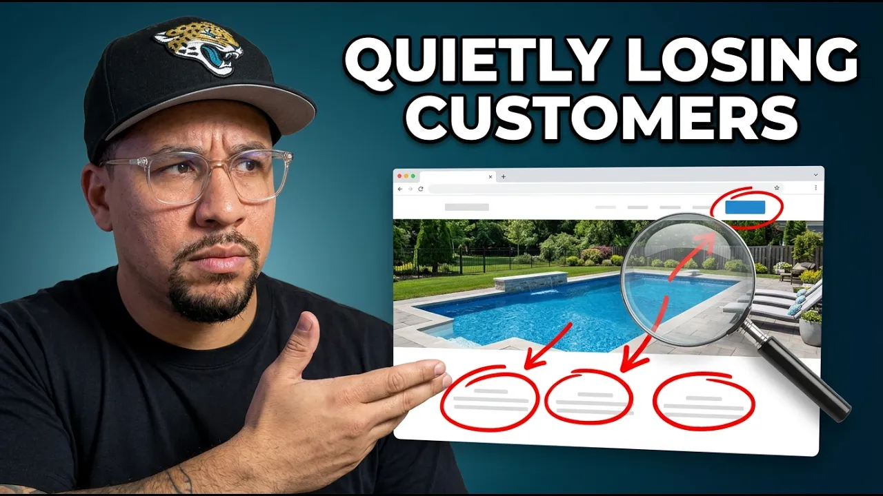
In the video above, I break down a real business website and walk through exactly where it loses people. It is the same approach I used in this breakdown of an auction company's site. Below, I have pulled out the lessons so you can check your own site against them. As you read, pull up your homepage in another tab. You will probably spot a few of these.
Here are the five mistakes that quietly cost businesses the most customers, and how to fix each one.
1. Your hero section does not earn the scroll
The hero section is the top of your homepage, the first thing a visitor sees before they scroll. It is the most important real estate you own.
Here is why. A visitor decides in a few seconds whether your site is worth their time. If that first screen does not give them a reason to stay, they do not scroll, they do not click to another page, and they do not contact you. They go back to the search results and try the next business.
Most hero sections fail this test in the same way. They lead with the company name and a logo, then a vague tagline that sounds nice but says nothing. The visitor reads it and still has no idea what they would actually get.
The fix: Lead with the outcome your customer wants, not a description of yourself. Say what they get, who it is for, and why you are different, all in the first screen. If someone can read your hero section and still not know what you do or why it matters, it is not working yet.
2. Your headline is about you, not your customer
This is the hero section mistake worth its own point, because it is everywhere.
A headline like "Quality Service in Your Area" or "Brilliant Design" feels professional, so businesses keep it. But it is empty. It describes you in words the customer cannot picture and does not care about. It asks them to do the work of imagining what that means for their life.
Good headlines do the opposite. They hand the customer the feeling or the result up front. The customer should see themselves in it instantly, with no guessing.
The fix: Write the headline from the customer's side of the table. What is the best version of what they get? Lead with that. Then let your image, the one behind the text, prove it. In a visual business especially, a strong photo plus a clear promise beats a clever line every time.
3. Your call to action is generic
"Contact Us" is the most common button on the internet, and one of the weakest.
The problem is that it asks for effort and offers nothing in return. There is no reason to click now instead of later, and later usually means never. It carries no urgency, no value, and no hint of what happens next.
The strongest call to action is built around an offer. Something specific, low effort, and easy to say yes to. A free quote. A free consultation. A free preview of the work. The job of the button is to make reaching out feel like the easy, obvious next step, not a commitment.
The fix: Replace "Contact Us" with the most valuable low-pressure offer you have, and lead with it everywhere. Make the click feel like the customer is getting something, not giving something up. That single change is often the difference between a quiet inbox and a full one.
4. You are hiding your best work
If your business is visual, your work is your strongest sales tool, and most websites bury it.
People buy what they can picture. A customer wants to scroll through real examples, find one they love, and think "I want that." When the work is reduced to a few small thumbnails, or scattered across pages with no real gallery, you take away the exact thing that would have sold them.
It also costs you in conversations. A good gallery gives customers a way to point and say "can you do this for me, but with that added?" You lose those talking points when there is nothing to point at.
The fix: Show the work, generously. Build a real gallery, ideally one for each service you offer. Let people browse finished results. Proof you can see beats a paragraph that describes it.
5. Your forms and links quietly break trust
The last mistake is the sneakiest, because it happens at the exact moment someone is ready to act.
A few things kill that moment. A button that sends visitors off your site entirely, with no way back, so they lose their place and leave. A quote form that looks nothing like the rest of your brand, so it feels untrustworthy and people hesitate to enter their information. A page that makes someone stop and wonder "is this even the right company?" right when they were about to reach out.
When you finally earn the click, the path to contacting you has to feel seamless and safe. Any friction or doubt at that step undoes everything the rest of the site did well.
The fix: Make the path to contact you clean and consistent. Keep forms on-brand and on-site. If a link has to open somewhere else, make sure it does not strand the visitor. The moment someone decides to act is the moment your site has to feel the most trustworthy, not the least.
The bigger shift: treat your website like a salesperson, not a brochure
Most websites are built like a brochure. A static thing that lists what you do and then sits there.
The best websites work more like your best salesperson. They greet the right people, lead with what matters, show proof, and make the next step easy. They are working for you while you are out doing the job.
None of the fixes above require rebuilding everything. Start at the top of the homepage, where the most people leave, and work down. Fix the hero, sharpen the call to action, show the work, and clean up the path to contact you. Each one plugs a leak.
If your website is getting visitors but not turning them into customers, the leak is almost always one of these five, and it is almost always fixable. Leave it alone and a weak website quietly costs you more than you think.
Want to know what is quietly costing you customers? I will take a real look at your website and show you exactly where it is leaking leads. No pitch, just a clear breakdown of what to fix first. And if you decide to bring in help, here is how to choose the right web designer.