Most established businesses are not losing customers because of their work. They are losing them because of their website. The work is strong. The site does not show it. So visitors do not trust it, do not see the value, and leave before they ever reach out.
I see this constantly, so I break down real local business websites to show exactly where it happens. This one is Vanish Auctions, a restaurant equipment auction and liquidation business with 13 years behind it. Good operation. Good reputation. A website that was quietly getting in its own way.
Here are the few things that mattered most, because they are the same things costing most businesses customers right now.
Your homepage has about five seconds
When someone lands on your site, the top of the page has to answer four questions fast. What do you do. Who is it for. Why does it matter. What should I do next.
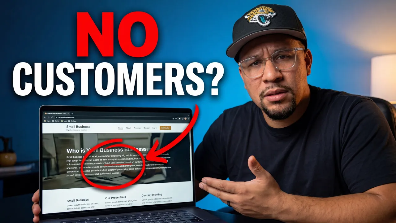
Vanish's original homepage did not. It opened by talking about itself, and the design leaned techy, with pixel edges and a tech-blue color that belongs on a software company, not an auction business. Before reading a word, a visitor got the wrong signal.
The fix is not complicated. A headline that says exactly what the business is, with a little personality: "Restaurant equipment auctions where both sides win." A subheadline that makes it plain: "We run online auctions for restaurant and commercial equipment. Sellers turn it into cash without the hassle. Buyers bid from anywhere and score deals."
That answers all four questions at a glance. What, who, why, and with a clear button, what next.
Pick one action and build around it
Every website should have one primary action. The single thing that drives the business, repeated throughout the site.
For Vanish, that action is getting sellers to book an auction. The logic is simple. Nobody can bid if there is nothing to bid on, and auctions come from sellers. So the whole engine starts there. "Book your auction" becomes the main button, in a solid color, while a lighter "Browse current auctions" sits beside it as the secondary path. Your eye goes where you want it to go.
Figure out the one action that makes your business money, then make it the obvious thing to do on every screen.
Empty sections read as "out of business"
This was the most damaging part. The site had a section that said "No current auctions" and another that said "Please check back." Blank space like that makes a site feel inactive. It quietly tells a visitor you might not even be running anymore, right at the moment they are deciding whether to trust you.
You have two options. Take the section out, or fill it with proof. For an auction business, the best fill is past deals. Show a commercial oven that costs $50,000 new, won at auction for $10,000. Photo, brand, price. That one example works on everyone. A buyer sees the deal and wants in. A seller sees real money instead of equipment sitting idle and wants in too. Empty space costs you. Proof earns you.
Talk about their problem, not your company
The original site mostly described itself. The stronger move is to speak to the people actually visiting, name their problem, and then offer yourself as the answer.
Vanish has two visitors: sellers and buyers. Start with the seller, since they feed the whole business. Instead of company history, lead with their pain: "Got equipment sitting idle? It loses value every day. Listing each piece yourself means lowball offers and no-shows. And you are not even sure what it is all worth." Then the relief: you handle the valuation, the marketing, the auction, and the pickup, and they walk away with cash and no hassle.
Then do the same for the buyer. When a visitor feels understood before they are sold to, they lean in. Follow it with a simple three-step process for each, never more than three, so it feels effortless to start.
Make it human, and make it scannable
A few smaller things that add up to trust.
Nobody reads walls of text. Keep it short, use bullets where you can, and write headlines strong enough that someone skimming still gets the message. Most visitors only read your headings, so make those carry the point.
Use real photos of real people. The owner, the team, the actual work. People buy from people, and a genuine photo builds more trust than any stock image.
And show reviews one at a time, large enough to actually read, with a real name and face. The original had a slider flying by too fast to follow. A review nobody can finish reading is just decoration.
The lesson underneath all of it
Vanish Auctions is a good business. The website was simply getting in its own way, the same way most do. The work is strong, but the site does not make it instantly clear what the business does, who it is for, why it matters, and what to do next. When people have to dig for that, they leave, and you never find out you lost them.
A website's entire job is to make those things obvious in seconds. Get that right and the site starts working for you instead of against you.
If yours might be doing your business a disservice, that is exactly what I help with. Book a free strategy session and I will walk through your site, show you where it is losing people, and map out what it would take to fix it.