You do great work. Your past clients would vouch for you. So why does the phone stay quiet even when people are landing on your site?
Most of the time it isn't your work. It's that your website doesn't show your work the way it deserves. Plenty of contractors and builders have the same gap. The company is excellent. Years in business, real craftsmanship, happy customers. But the homepage leaves first-time visitors guessing, and guessing visitors don't call. That gap quietly costs contractors work every week.
Here are five of the most common things costing contractor websites calls, and what to do instead.
1. A hero section that moves too fast
The top of your homepage is the most valuable space you own. It decides whether someone keeps scrolling or hits back. A lot of contractor sites put a rotating slider up there, with text that changes before you can finish reading it. The one line that might have convinced someone to stay is gone in two seconds. Use one clear image and one clear message instead. Say what you do, who it's for, and where. No rotation, no guessing. (Most visitors decide in the first five seconds, so this section carries more weight than any other.)
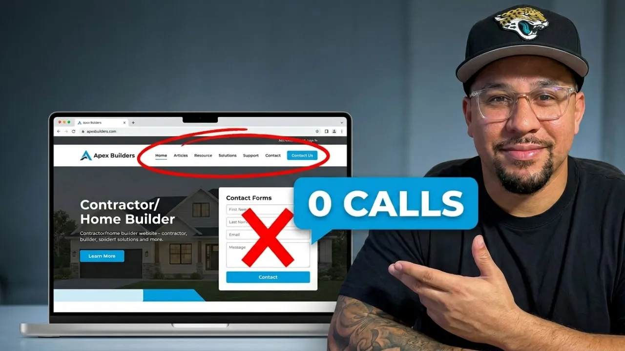
2. Labels nobody understands
Menus full of clever or vague labels are a quiet killer. To the people who built the site, the words make sense. To a first-time visitor they're a riddle. When someone has to guess what a page is, they don't. They leave and click the next result on Google. Write for the person who has never heard of you. Plain words beat clever ones every time.
3. A list that does nothing
Long lists of service-area cities show up on a lot of contractor sites. Not clickable, no map, no purpose. They don't help visitors and they don't help search either. Replace the list with one clear line and a simple map, something like “We design and build custom homes across the Space Coast.” Now it has a reason to exist.
4. A contact form with no next step
“Ready to get started?” with a form underneath is a good idea that usually falls flat, because it never says what happens after you hit send. Do they call me? Email me? Show up at my door? When people don't know what comes next, they don't fill it out. Tell them exactly what happens. “Send this and we'll call you within one business day to set up your consultation.” Certainty gets the click. (It's one of five mistakes that quietly cost you leads.)
5. Sections with no context
Blog posts, galleries, and callouts often sit on the page with no label, just images and titles floating with nothing to explain them. The visitor is left to figure it out alone. Label everything. Nobody should have to work out what they're looking at.
What your homepage should actually do
Strip it back, and a website that actually works does four things in order. It tells people what you do, who it's for, and where, in the first screen. It shows proof right away, with reviews, real photos, and award badges. It walks them through what working with you looks like, step by step. And it ends with one clear next step. Book a call. Visit the model home. Request a consultation. Clear beats clever. Certain beats vague.
The bottom line
Your website isn't a brochure. It's your hardest working salesperson. If it confuses people, it costs you the exact clients you'd most want. Great contractors lose work all the time, not because of the work, but because the site doesn't say so clearly. If you've leaned on referrals and figured the site doesn't matter much, that belief is quietly costing you the best work. Most contractor websites have this gap, and closing it is usually faster than you'd expect.
Want this for your site?
If your website gets traffic but not enough calls, I can show you where it's leaking. I run free one on one strategy sessions where we go through your site together and build a clear plan to fix it. No pitch. Just a straight look at what's costing you calls.
Book your strategy session: https://calendly.com/createdbymello/meeting