Most dental practices are far better than their website makes them look. The dentistry is great, the team is great, the patient experience is great. Then a new patient lands on the homepage, feels none of that, and quietly clicks over to the practice down the street.
That is the gap. And in dental website design, that gap is what costs you booked appointments every single week. Below are the four reasons your site is losing patients, broken down on a real Dallas dental homepage, plus what to fix in each one.
The Gap Between a Great Practice and Its Website
Your website is not a brochure. It is the first appointment. It is where a nervous, first-time patient decides in a few seconds whether they trust you enough to pick up the phone.
When the site does not reflect the quality of the practice, you do not just lose a visitor. You lose a patient who was ready to book, to a competitor whose website simply communicated better. That is why website design is not cosmetic for a dental practice. It is a patient acquisition system. If you want the bigger picture on this, here is why most visitors leave a website in the first 5 seconds.
The 4-Pillar Website Audit for Dental Practices
Every site I review runs through four lenses: Clarity, Positioning, Trust, and Action. Miss one and a great practice loses patients it never even knew it had. You can run your own site through the same framework with this 4-pillar website audit checklist.
Reason 1: Clarity, Your Headline Is Wasted on a Slogan
On the practice I reviewed, the biggest, boldest text on the screen was a slogan: "We Make it Easy to Smile." The actual who and where, "Dentist, Dallas, TX," was shrunk down to tiny eyebrow text almost nobody reads.
The hierarchy was backwards. The loudest element on the page said nothing, while the most important message was the quietest thing on the screen. A first-time visitor could not tell what the practice did or where it was in two seconds, so they left.
The Fix
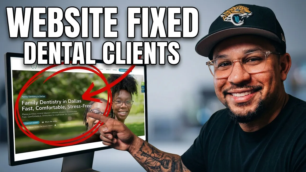
Your headline is your most expensive real estate. It should carry your most important message, not a vague slogan. Rewrite it to say what you do, where you are, and how it feels: "Family Dentistry in Dallas. Fast, Comfortable, Stress-Free." Now the biggest text on the page is doing the biggest job.
Reason 2: Positioning, Your Best Strengths Are Hidden
This practice had real, rare strengths. They welcomed special needs patients, offered same-day appointments, and provided sedation options. That is genuinely differentiated. The problem: none of it was in the hero. It was buried far down the page where almost no one scrolls.
The exact things that would make a patient choose them over any other dentist in the city were invisible at the moment the decision was being made. A differentiated practice was presenting an ordinary-looking website.
The Fix
Your best reasons to choose you should be the first thing people see, not a reward for scrolling. Pull your strongest differentiators straight into the hero: "Dental care for the whole family, including special needs patients. Same-day appointments and sedation available." Let the thing that makes you different do the selling.
Reason 3: Trust, No Reviews and the Wrong Photos
The live hero showed no reviews, no star ratings, just a stack of phone numbers up top. Meanwhile the practice had hundreds of happy patients. All that credibility existed, and none of it was visible where it mattered.
The photos worked against them too. Stock-style imagery, and shots that did not reflect the real patients or the real feeling of the office. A first-time patient does not hand over their mouth, or their money, to a stranger they have no reason to trust yet.
The Fix
Trust has to show up before people scroll, not after. Put your proof at the top: "4.9 stars, 300+ Google reviews," plus a reassurance line like "Most Insurance, Medicaid and CHIP Accepted." Use real, warm photography that looks like your actual practice. This is the same pattern that separates a site that converts from one that does not, which I break down further in why your website isn't converting.
Reason 4: Action, Too Many Competing Buttons
The hero had two buttons fighting each other: "Redeem Offer" and "Apply For Financing." Give a first-time visitor two competing choices and you often get zero. Worse, "Apply for Financing" is a strange first thing to ask a stranger who just arrived. It assumes a decision they have not made yet.
A great practice, one confusing step away from a booked appointment.
The Fix
One hero, one primary action. Everything else is secondary. Lead with a single clear button, "Book Your Visit," and keep "Call" as a quiet backup. Give the visitor one obvious next step and more of them will take it.
How This Connects to Getting More Dental Patients
Here is the part most practices miss when they think about how to get more dental patients. You do not always need more traffic. You need your existing traffic to convert. If a hundred people visit this week and the homepage loses ninety of them to a weak headline, hidden strengths, missing trust, and a confusing button, then buying more ads just pours money into a leaky funnel.
Fix the four pillars first and every visitor you already have becomes more likely to book. This is also why a cheap or DIY site so often costs more in the long run, which I cover in why a cheap website actually costs you more.
Want a Website That Matches How Good Your Practice Actually Is
This is exactly what I do. I close the gap between how good a practice is and how good its website looks, so it actually books patients. I have broken down the same four pillars across other industries too, like this law firm website teardown, because the principles hold everywhere.
If your dental website looks fine but is not turning visitors into booked appointments, let's fix that.
Book a free strategy call and I will show you exactly what is holding your site back.