You might be surprised by the real reason.
It is usually not your work. Plenty of landscape companies do beautiful work, have done it for decades, and still struggle to turn website visitors into clients. The work is there. The website just does not show it well enough to win the job.
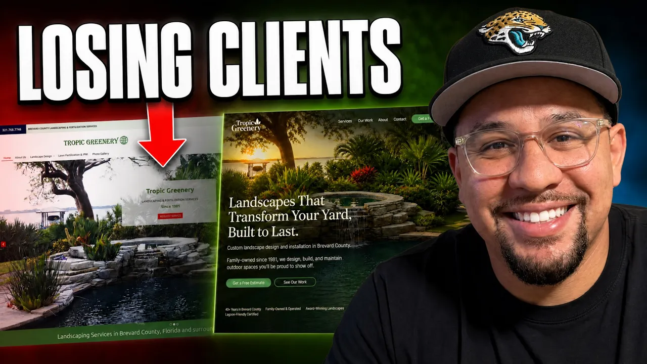
Let me walk you through a real example. This is a landscape design company that has been around since 1981. Nearly forty years in business. That kind of longevity speaks for itself, because you do not last forty years doing bad work. Their portfolio is genuinely beautiful. And yet the website is quietly leaving money on the table. Here is where, and how to fix it.
The decision happens at the top of the page
When someone lands on your site, the top of the page, the first thing they see before scrolling, decides whether they stay or leave. If you want the full version of this idea, I broke it down here: people decide in about five seconds.
That top section has four jobs. It has to answer:
What do you do. Who is it for. Why does it matter. What should I do next.
If it nails those, a visitor can decide to call you without scrolling another inch. If it does not, they leave, and they go to a competitor. Everything below is about whether this landscaper's page answers those four questions.
The slideshow looks nice and says nothing
The page opens with a rotating slideshow of past projects. The work is lovely. But there are two problems.
First, the photos are a little low resolution, with some pixelation around the edges. For a business whose entire pitch is "look how beautiful we make things," the photos have to be flawless. This is the one place to invest in a professional photographer. Your images are your product.
Second, and bigger, the text over the slideshow does not change as the pictures change, and it just repeats the company name. The name is already in the logo right above it, so it is redundant. That prime space, the most valuable real estate on the whole site, is being spent saying nothing.
That space should be answering the four questions. Instead it is decoration.
The button leaves people guessing
There is a bright red "Request Service" button. It does stand out, maybe too much, since it clashes with the rest of the brand. But the real issue is the words.
"Request Service" for which service? This company does design, installation, maintenance, fertilization, and more. The visitor does not know what they are about to ask for. Every moment of guessing is friction, and friction loses people.
A button should say exactly what happens when you click it. "Get a free estimate" tells the visitor precisely where they are headed. No mystery.
The layout fights what people expect
People have used the internet for a long time. They expect certain things in certain places. When your site breaks those patterns, it feels off, even if the visitor cannot say why.
On this page, the menu sits far to the left, the contact button is stranded by itself on the far right like an island, and the phone number is somewhere else again. It is easy to miss the thing you most want people to click. The hero image is also cut off awkwardly on both sides.
Good design uses familiar patterns on purpose. A clean menu, the main action where people expect it, nothing stranded or hard to find.
The logo looks dated and off-message
The logo features a globe icon, and it is not clear what a globe has to do with a tropical landscaping company. It also looks dated and slightly warped. A logo is supposed to be simple, memorable, and tied to what you do, so people recognize you instantly.
This is also what tends to happen when the logo and the website come from two different people who never coordinate. The cleaner path is one designer handling both your brand and your site, so everything fits together and looks intentional.
What the redesigned version says instead
Here is the difference a clear top section makes.
The new headline: "Landscapes that transform your yard, built to last." That is what they do and why it matters in one line. The "built to last" part is doing quiet, important work, because in Florida the sun and rain punish yards constantly. A landscape that holds up is exactly what a local homeowner wants.
Then a second line: "Custom landscape design and installation in Brevard County." That is the what and the who, plainly. Brevard County homeowners, this is for you.
Then a line that adds instant credibility: "Family owned since 1981. We design, build, and maintain outdoor spaces you will be proud to show off." Forty years of trust, built right into the top of the page.
One primary button: "Get a free estimate." That is the action that leads to the work. Someone gets an estimate, likes it, and the project begins. So that is the button that earns its place front and center.
The menu gets simplified to what people actually want: Services, Our Work, About, Contact, and the estimate button. And it follows you as you scroll, so the way to act is always one click away, no matter how far down the page someone reads.
And the hero image becomes a single, professional shot of their best work. The kind of finished yard that makes a visitor picture it at their own home and think, I want that. A great image here is worth more than any paragraph.
The takeaway
A landscape company can have decades of beautiful work and still lose clients on its website. Not because the work is lacking, but because the top of the page makes a visitor work to understand it, or fails to make them feel anything.
So the top of your homepage has to do four things, fast. Say what you do. Say who it is for. Say why it matters. And give one clear next step. Add a touch of proof, like your years in business, and let one stunning photo carry the rest.
Get that right and people stay, scroll, and reach out. Get it wrong and they leave for a competitor, and every visitor who leaves is money that could have been yours. For a business doing work this good, the website should be working as hard as you do.
If your landscape design website might be losing clients before they ever reach the contact form, that is exactly what I help fix. Book a free strategy session and I will walk through your site and show you where clients are slipping away, and what it would take to keep them.